.svg)

We are DitchCarbon
Guides / Getting Started
Set up your account and begin using DitchCarbon
Welcome to DitchCarbon! This guide will help you set up your account and get started with using the platform.
Introduction
DitchCarbon helps procurement and sustainability teams measure and reduce Scope 3 emissions. Our platform provides accurate emissions insight on suppliers without requiring surveys, integrating with tools like SAP, Coupa, and Salesforce.
Quick Start
- Create an account - Sign up at ditchcarbon.com
- Connect your data - Import your supplier data or connect with your existing procurement system
- View your dashboard - Get immediate insights into your supplier emissions
Key Features
- Supplier Emissions Tracking - Monitor emissions across your entire supply chain
- Automated Data Collection - No surveys needed, we gather data automatically
- Integration with Existing Tools - Seamless connection with SAP, Coupa, and Salesforce
- Actionable Insights - Identify hotspots and opportunities for emissions reduction
Next Steps
Ready to dive deeper? Check out these resources:
Guides / Dashboard
Learn how to use the main dashboard and analyze your data
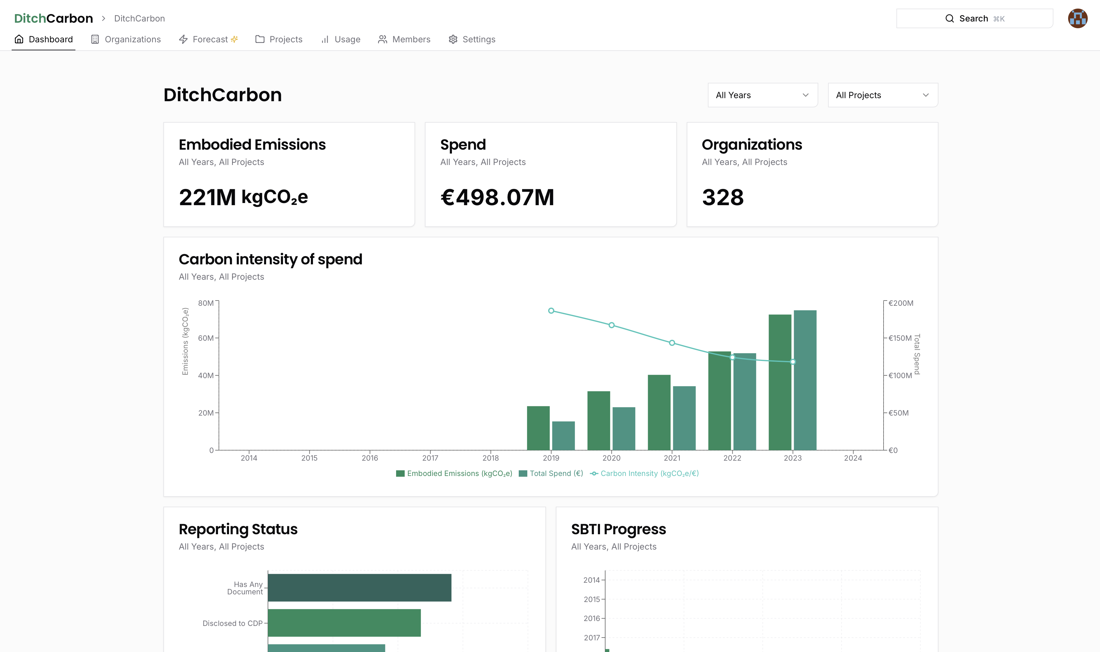
Dashboard Overview
The DitchCarbon dashboard is your central hub for monitoring and analyzing carbon emissions across your organization and supply chain.
Filter the Dashboard by Project and Year
- Select specific project(s) to display (if you have multiple projects) or choose "All Projects" to see a combined view.
- Choose a specific year or all years of spend data to focus your analysis.
View the Embodied Emissions Estimate of Your Portfolio
- In the Embodied Emissions section, see the total emissions across your chosen project(s) and year(s).
- Toggle between using organization-specific primary data where available and using industry-average emission factors only to calculate your emissions.
- View changes in total spend and total emissions for each year.
Analyze the Carbon Intensity of Your Spend Over Time
- The Carbon Intensity of Spend line graph shows your carbon intensity (emissions relative to spend) across different years.
- Compare the line using organization-specific primary data where available (solid line) vs. the industry-average (dotted line).
- Monitor how your portfolio's carbon intensity changes over time, a helpful metric for procurement teams to evaluate the impact of their actions.
Analyze Your Portfolio Based on Different Reporting Criteria
- The Reporting Status section breaks down which organizations in your porfolio:
- Disclose any carbon data
- Disclose to CDP and are committed to Science Based Targets
- Disclose Scope 1, 2, and 3
- Provide a organization-specific emission factor
- Click on any metric to drill down and view the specific organizations behind those stats.
Track Your Progress Toward Science Based Target Goals
- The SBTi Progress widget shows which organizations have committed and set validated Science Based Targets
- View this by percentage of your emissions, percentage of your spend, or percentage of organizations covered.
- Track how your portfolio's SBTi coverage evolves over time.
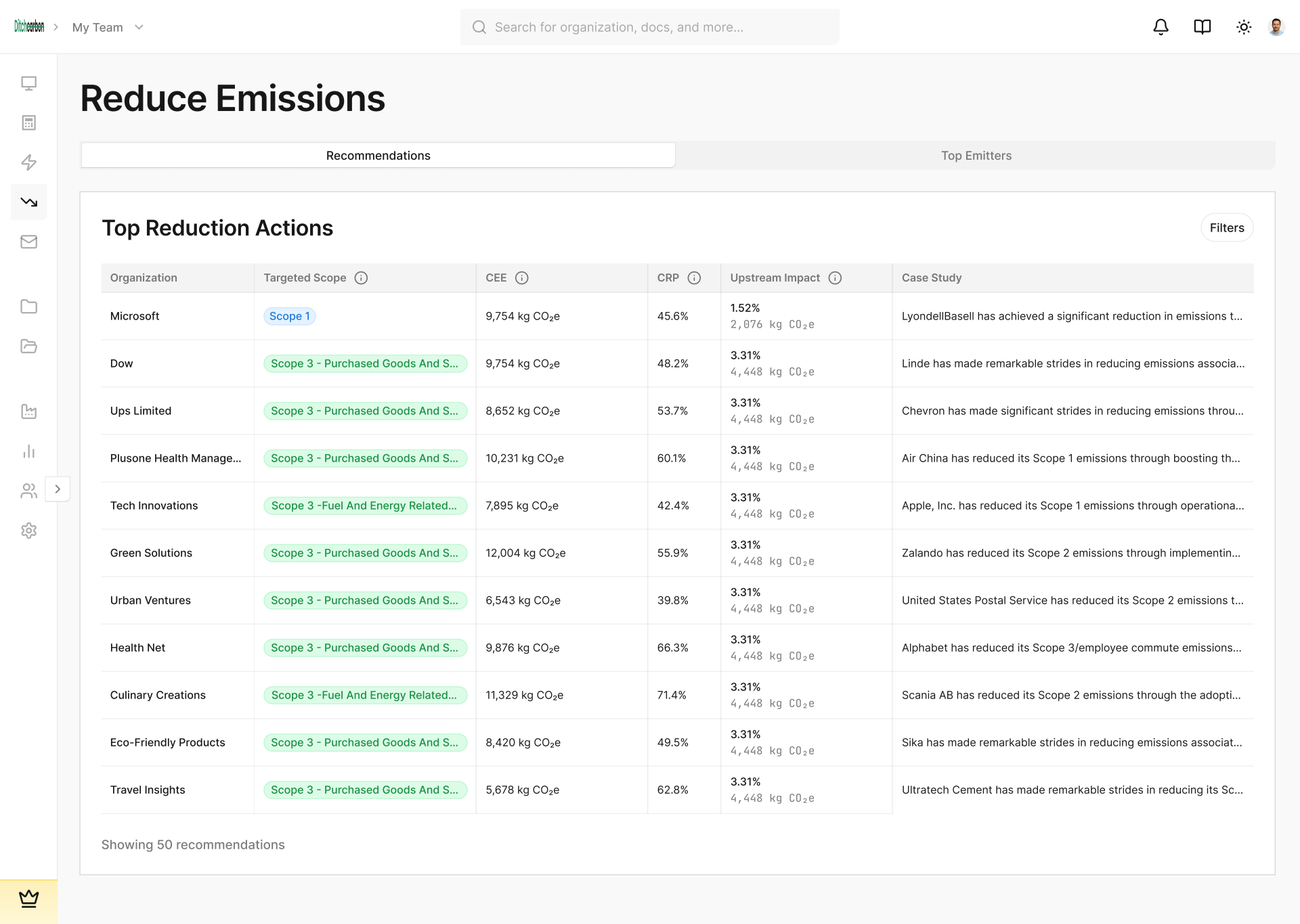
Identify Key Organizations to Focus on Using the Carbon Intensity Heat Map
- In the Carbon Intensity Heat Map, bubble size represents total emissions from spending on each organization, by default.
- Bubble color indicates how well the organization performs relative to peers in the same industry.
- Large red bubbles signal organizations with high emissions and poor performance, making them priority candidates for engagement or replacement.
Identify Key Regions Your Portfolio Is Exposed To
- The Global Emissions Distribution map shows where your emissions occur geographically.
- Absolute view: highlights countries based on grid intensity (green = lower intensity, red = higher intensity).
- Relative view: shows hotspots of emissions tied to your actual spend, helping you pinpoint key areas of focus.
Guides / Organization
Organizations Overview
Organizations in DitchCarbon represent the companies in your supply chain that you want to track emissions for.
Filter by Project, Year, and Organization Attributes
- Choose a specific project or select All Projects to combine data.
- Select a specific year or All Years to refine your analysis.
- Further filter the list by region, primary business activity/industry, or by emission factor type (Organization-specific vs. industry average).
Sort Organizations by Different Criteria
- Embodied Emissions: Identify which Organizations contribute the most total emissions.
- Total Spend: Sort by your overall financial outlay with each Organization.
- Ditch Carbon Score: Compare Organization performance based on 30+ carbon data points.
- Benchmark: Evaluate a Organization's percentile rank relative to peers in the same sector.
Check Ditch Carbon Score and Benchmark
- Ditch Carbon Score: An overall rating calculated from a broad set of carbon indicators.
- Benchmark: A percentile-based comparison showing how a Organization performs against others in its industry.
Understand Emission Factor Types
- Industry Average: Used if the Organization hasn't disclosed enough data to establish a unique factor.
- Organization-Specific: Calculated from the Organization's disclosed Scope 1, 2, and upstream Scope 3 emissions, proportioned by global revenue.
Access and Manage Organization Details
- Click on a company's name to view its detailed profile.
- Edit Spend or Delete an organization directly from the list.
Add Organizations to Your Project
- For single additions, click Add and input the new Organization's details. After creating, you can add annual spend data.
- Use this approach for a small number of new Organizations.
Import Organizations in Bulk
- Click Import to upload multiple Organizations at once (e.g., dozens or hundreds).
- Download the sample CSV, match your data formatting to it, and import.
- Add as many Organizations as needed-in bulk-directly to the selected project.
Export Your Data
- Click Export to download all underlying data in CSV format.
- Choose the project you'd like to export and retrieve a raw data file for further analysis.
Guides / Team and Projects
Collaborate with team members and organize projects
Team and Projects Management
Learn how to manage your team members and organize your work into projects.
Manage Team Roles and Members
- Owner role: Full administrative control, including adding/removing team members, creating projects, and assigning access.
- Team Member role: Limited to the projects they are granted.
- Pro accounts can Invite, edit, or remove team members at any time, specifying their role and project access.
Create and Manage Projects
- Segment Organizations by different categories or groups to keep work separate.
- Control who sees what: add or remove members from each project based on their role or needs.
- View all projects at once, or select specific projects for a focused view.
Guides / Settings
Configure your account and preferences
The Settings section allows you to configure your DitchCarbon account and set your preferences.
Adjust Team and Account Settings
- Rename your team and change personal details (email, password) under Settings.
- Switch your display currency-all past spend is automatically converted using annual averages.
Configure Emission Factor Fallback Logic
- Choose whether to use supplier-specific data from the most recent disclosed year or industry averages if current-year data is missing.
- The default is to apply the closest supplier-specific emission factor, ensuring smoother year-to-year comparisons.
Guide/ Organization / Overview
Detailed guides for working with organizations
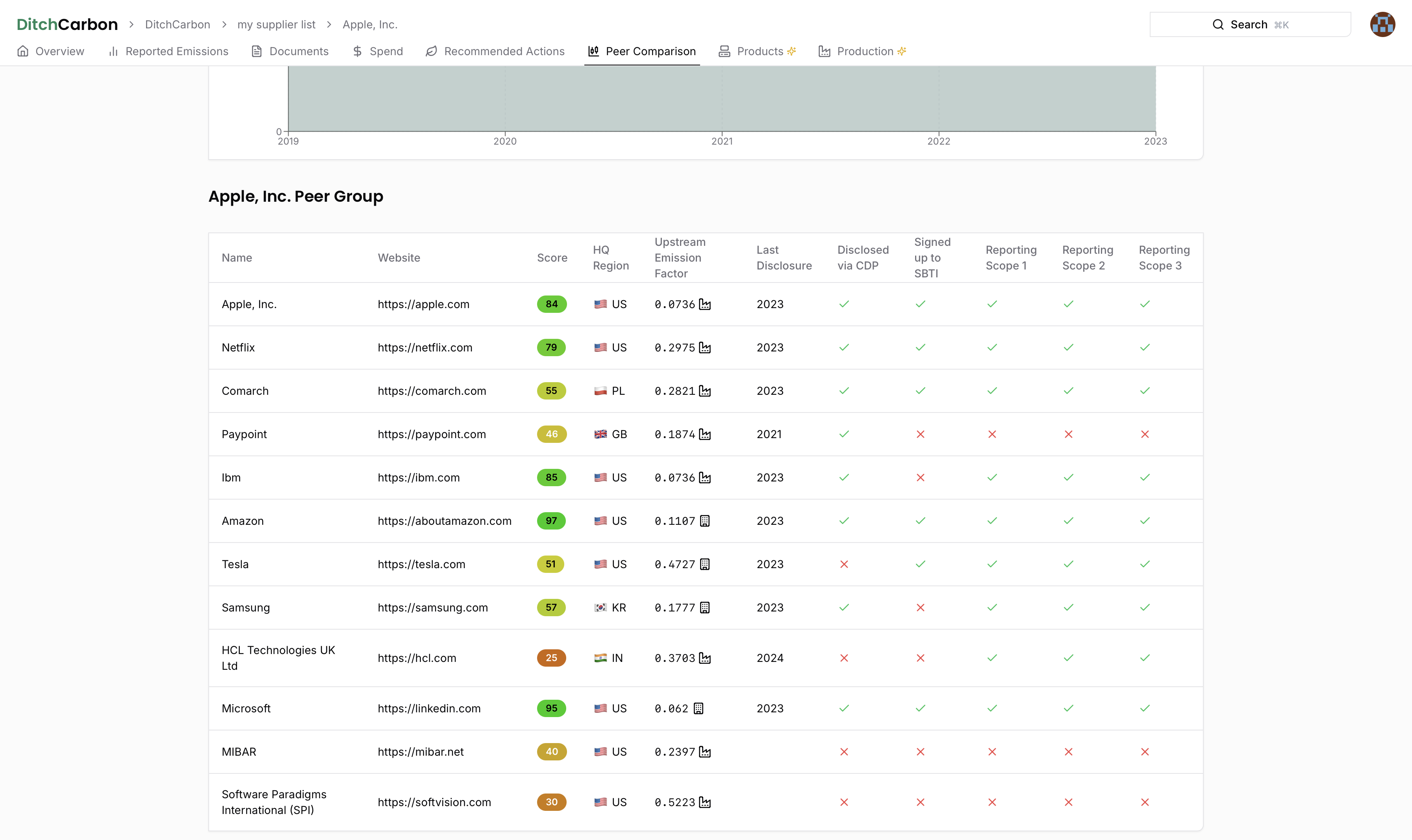
Organization Overview
When you click on an organization in your dashboard, you'll be able to access detailed information about that organization.
Check the Ditch Carbon Score
- Compare the Organization's overall score against the industry average for computer services.
- The top 5% benchmark indicates strong performance across 30 carbon data points (a sign of robust climate action).
View Emissions Data Summary and Industry Intensity
- View a summary of disclosed emissions for the selected organization.
- See how the industry's emission intensity (emissions per dollar) ranks globally, offering context on the Organization's sector.
Evaluate Regional Impact
- Note the primary region (e.g., U.S.) and its overall grid intensity ranking.
- In this example, the U.S. is in the second-lowest quintile for carbon intensity among global regions.
Review Climate Commitments
- Identify any initiatives the organization participates in (e.g., Science-Based Targets).
- Hover over listed commitments to explore more details on their climate actions.
Guides / Organization / Documents
View source documents and assurance details
Organization Documents
The Documents tab provides access to all source documents and assurance details for an organization's emissions data.
View Disclosure Sources
- View source documents for the reported emissions displayed under Reported Emissions.
Check Assurance Details
- Hover over the checkmark icons to see:
- Level of assurance (e.g., Limited or Reasonable)
- Scopes covered (Scope 1, 2, and Scope 3)
- Exact text taken from each assurance document
- Auditor information, when disclosed
Guide / Organization / Emissions
Analyze emissions data and factors
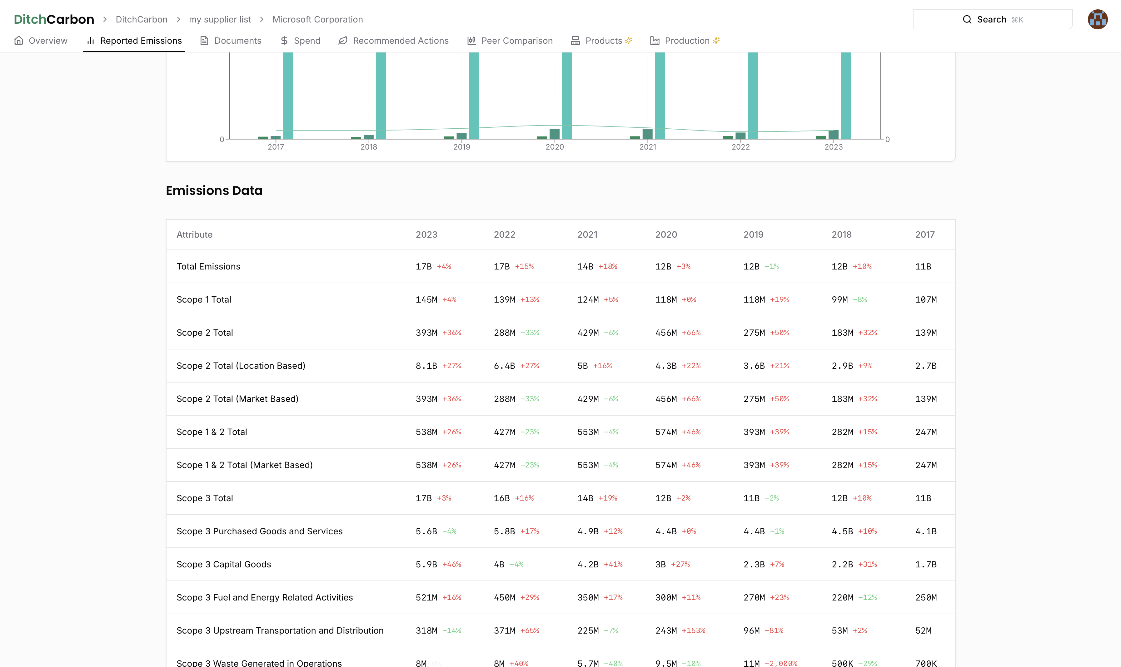
Organization Emissions Data
The Emissions tab provides detailed information about an organization's carbon emissions across different categories and reporting years.
View the Organization's Reported Emissions
- In this case YouTube is not disclosing, but its ultimate parent Alphabet is.
- Emissions data stretches from 2013 to the latest available year, 2023.
Analyze Scope 1, 2, and 3 Over Time
- The chart displays Scope 1, Scope 2, and all upstream Scope 3 emissions.
- Track how emissions intensity (emissions relative to global revenue) changes by year.
Understand the Three Emission Factors
- Yellow Line: Alphabet's Scope 1 & 2 emissions, divided by global revenue.
- Total Upstream Factor: Combines Scope 1, 2, and all upstream Scope 3 categories (only shown if Alphabet discloses all relevant Scope 3 data).
- Green Line: An industry-average factor for U.S. computer services, enabling a baseline comparison.
Compare the Organization's Emission Factor to the Industry Average
- Alphabet's operational emissions intensity is ~25% lower than the average for similar companies in its sector.
- Use these comparisons to gauge relative performance against industry peers.
View Detailed Disclosure Over Time
- The table beneath the chart shows which scopes and categories Alphabet discloses each year.
- Hover over any data point for a precise numerical value if the table's figures appear abbreviated.
Guide / Organization / Forecast
Project future emissions and plan reduction strategies
Emissions Forecast
The Forecast tab allows you to project future emissions and plan reduction strategies based on historical data and targets.
Explore the Forecasting Module
- View Scope 3 emissions projections from now through 2050 based on the reduction targets set by Organizations in your portfolio.
- Compare different scenarios (Optimistic, Base, Pessimistic) against your target reduction goals to understand if you are pacing.
Configure and Compare Scenarios
- Optimistic: In this demo, configuration assumes 100% attainment of any targets applying to Organizations, starting with their Science-Based Targets (SBTi) or annual report commitments, and falling back to other targets that could apply, such as an Organization's headquarter country's Net Zero Target.
- Pessimistic: Only considers SBTi-validated or annual report targets, and discounts the rate of progress (e.g., achieving only 90% of a stated target by the pledged date). If no target is disclosed, emissions are assumed to grow unabated with spend.
Identify Organizations Driving Your Forecast
- See emissions forecasts by Organization extending to 2050 under your chosen scenario configuration.
- Track which Organizations have pledged to reduce emissions-and which remain "unabated" with no stated goals.
Mitigate Disclosure Gaps
- Identify Organizations not reporting all relevant Scope 3 categories for their industry
- Engage with Organizations to address these missing disclosures early to avoid unexpected emission spikes later
Prioritize Engagement Based on Future Emissions
- Pinpoint Organizations contributing most to your emissions in 2025 or 2050 who also lack near-term or net zero targets.
- Use these insights to focus your engagement on Organizations with the highest potential to reduce your overall footprint moving forward.
Understanding Forecast Methodology
Why Forecast Starting Points May Differ from Calculate Dashboard Totals
You may notice that the starting point emissions values in your forecast scenarios don't exactly match the total emissions sum displayed on the Calculate dashboard. This is expected behavior and stems from methodological differences between the two calculation approaches:
Calculate Dashboard (Yearly Spend):
- Uses industry total upstream emission factors applied to total spend
- Provides a single emissions value per organization using industry averages
- Shows total emissions across all scopes combined
Forecast (COEF):
- Uses a hybrid emission factor approach for more accurate projections
- Combines organization-specific factors (where disclosed) with industry factors (as fallback)
- Splits emissions by scope to enable pathway-specific forecasting
- More granular approach that separates Scope 1, 2, and 3 emissions for better target tracking
When Disparities Occur: The difference is most pronounced when there's sufficient data to calculate organization-specific Scope 1 or Scope 2 emission factors, but insufficient data for a comprehensive total upstream emission factor. In these cases:
- Scope 1/2 factors "pull down" the overall emissions in the forecast starting point
- Calculate dashboard continues using industry averages for total upstream emissions
- This results in different baseline values, but the forecast methodology provides more accurate, actionable projections
This hybrid approach ensures that forecasts leverage the most accurate emission factors available for each organization and scope, enabling better target validation and reduction pathway planning.
Guide / Organization / Organization Forecast
Visualize an organization's past, present, and future emissions – and instantly see if it is on-track for its climate targets.
The Forecast tab helps you understand how a single organization is progressing – or expected to progress – toward its stated reduction targets.
It brings historical disclosure, linear Science–Based Targets (SBT) trajectories, and trend-based projections together in one place so you can engage suppliers with data-driven insight.
What You'll See at a Glance
- Interactive emissions chart combining:
- Historical emissions (solid columns)
- Target line – straight, green line showing the linear path required to meet the selected reduction target
- 2-year trend projection – dashed blue line extrapolating the last two years of performance
- 5-year trend projection – dashed purple line extrapolating the last five years of performance
- Targets table listing every active reduction target (end year ≥ 2026) and a simple on-track emoji for each:
- ✅ both 2- and 5-year trends meet or exceed the required annual reduction rate
- 🟡 only one trend is on track or the other lacks data
- ❌ neither trend is on track
- ➖ insufficient data for both trends
- Scope & Classification toggles so you can switch between:
- Scopes: All Scopes, Scope 1, Scope 2, Scope 3 (upstream), Scope 3 (total)
- Target type: Absolute (kgCO₂e) or Intensity (kgCO₂e / revenue)
How the Forecast Is Calculated
- Historical data comes from the organization's disclosed performance (Scope 1, 2, and 3) in its annual reports.
- Target line uses the organization's applicable reduction target (SBTi, annual report, or national-level fallback) and shows the straight-line trajectory from baseline year → target year.
- Trends & projections measure the compound annual reduction rate over the most recent 2-year and 5-year windows – if enough data exists – and project that rate forward to 2050.
- On-track status simply checks whether each trend's annual reduction rate is ≥ the rate required by the target line.
These calculations exactly mirror the logic outlined in our Organization Forecast Specification and are executed automatically in the background. Results are cached so the tab loads instantly once processing is complete.
Practical Ways to Use This View
- Spot risk early – if a key supplier shows 🟡 or ❌ flags, open a dialogue about their decarbonisation plan before it jeopardises your own goals.
- Validate commitments – compare corporate marketing claims with the hard math of historical performance.
- Choose the right metric – swap to Intensity when you need to account for rapid growth or inflation.
- Drill into Scopes – isolate Scope 3 (upstream) to see whether purchased-goods emissions are coming down fast enough.
Tips & Tricks
- Hover on any data point to see the precise kgCO₂e value and year-on-year percentage change.
- Use the legend to temporarily hide lines and focus on a single trajectory.
- Historical bars extend only to the current reporting year – projections take over beyond that point.
- The chart automatically scales to 2050 when viewing All Scopes to accommodate net-zero targets.
Limitations to Keep in Mind
- Projections rely on past trends; sudden operational changes can alter the path.
- Intensity targets require revenue data – if none is available, intensity calculations default to zero.
- Very young companies with fewer than three years of disclosures may show limited or no projections.
Need help interpreting a forecast? Reach out via in-app chat or email support@ditchcarbon.com – our climate data team is happy to walk you through the numbers.
Guide / Organization / Production
Track production data
Organization Production Data
The Production tab allows you to track and analyze production data for an organization.
Leverage Production Emission Factors
- Some suppliers (e.g., Tata Steel) share emissions per production unit (like per ton of steel).
- These can replace industry-average factors if you know how many units you've purchased, resulting in a more accurate footprint estimate.
Track Other Intensity Metrics
- Some companies disclose emissions per employee or similar ratios.
- Compare emissions intensity over time to see if they're reducing carbon output as they expand.
Guide / Organization / Products
Manage products for organizations
Organization Products
The Products tab allows you to view and manage all products associated with an organization.
Use Product Emissions Reports For More Detailed Calculations
- Navigate to the Products section for a given company (e.g., Google) to see Product Carbon Footprints (PCFs) for individual hardware items.
- Each PCF entry shows its original data source, per-unit total carbon, and the boundary (life cycle stages) included in the footprint.
- Use PCFs in your footprint calculations if you have detailed data on the units purchased.
Review Publicly Disclosed PCFs
- Google's publicly shared PCFs appear in all user accounts.
- These details help you understand where emissions occur in the product's life cycle.
Manage Private PCF Submissions
- Organizations can privately upload PCFs via a separate survey link, granting access only to specific users instead of all users.
- This keeps sensitive product-level emissions data confidential yet accessible to approved users.
Guide / Organization / Spend
Manage spend data
Managing Organization Spend
The Spend tab allows you to track and analyze your spend data with an organization.
Add or Edit Yearly Spend
- Click Add Yearly Spend in the top corner, or select Edit Spend for any previously uploaded spend data.
- Adjust the value to update or correct Organization spend information.
Delete Existing Spend Entries
- Remove any spend data you no longer need by choosing Delete on the relevant entry.
Change Currency Settings
- Go to the Settings menu (top-right).
- Enter your password, then select from USD, EUR, or GBP as your default currency.
- All uploaded spend after this change will use the newly selected currency, and emission estimates will be calculated accordingly.