.svg)
Carbon intensity of spend
DitchCarbon plots carbon intensity of spend against the industry intensity for the same categories, so a team can see whether the organisations it buys from are outperforming their sector.
The chart plots your emissions and spend together with two intensity lines: your own carbon intensity, and the industry intensity for the same categories. Where your line sits below the industry line, the organisations you buy from are outperforming their sector. Where it sits above, the years and categories to look at first are visible.
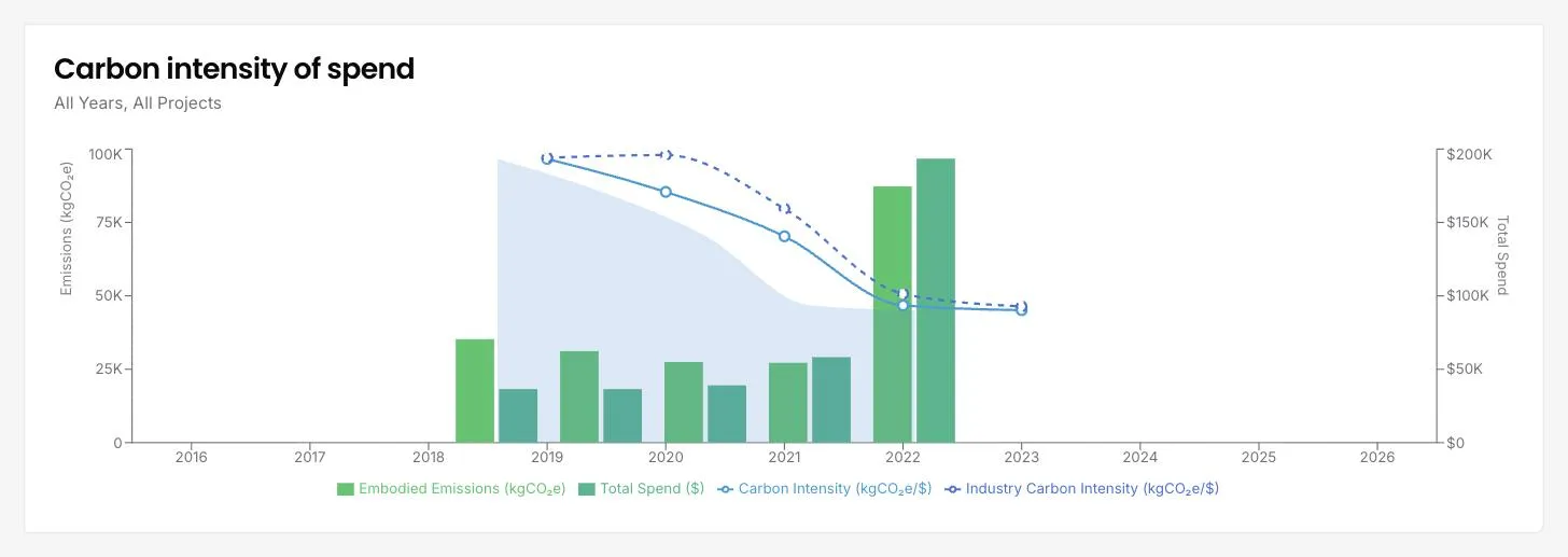
Carbon intensity per unit of spend is the measure that survives a change in volume. Total emissions rise when you buy more, which makes year on year comparison unreliable if the business grew. Intensity strips that out, so a falling line means the supply chain got cleaner rather than smaller.
The industry line is what makes your own line mean anything. On its own, an intensity figure is a number without a scale. Against the sector for the same categories it becomes a position: ahead, behind, or moving the right way while the sector moves faster.
Both lines are drawn from the same underlying data, so the comparison is like for like rather than your measured figure against somebody else's estimate.
Common questions

See it on your own suppliers, portfolio or profile
Numbers you can defend within 2 weeks, or one profile that answers every buyer asking.