.svg)
Reduce
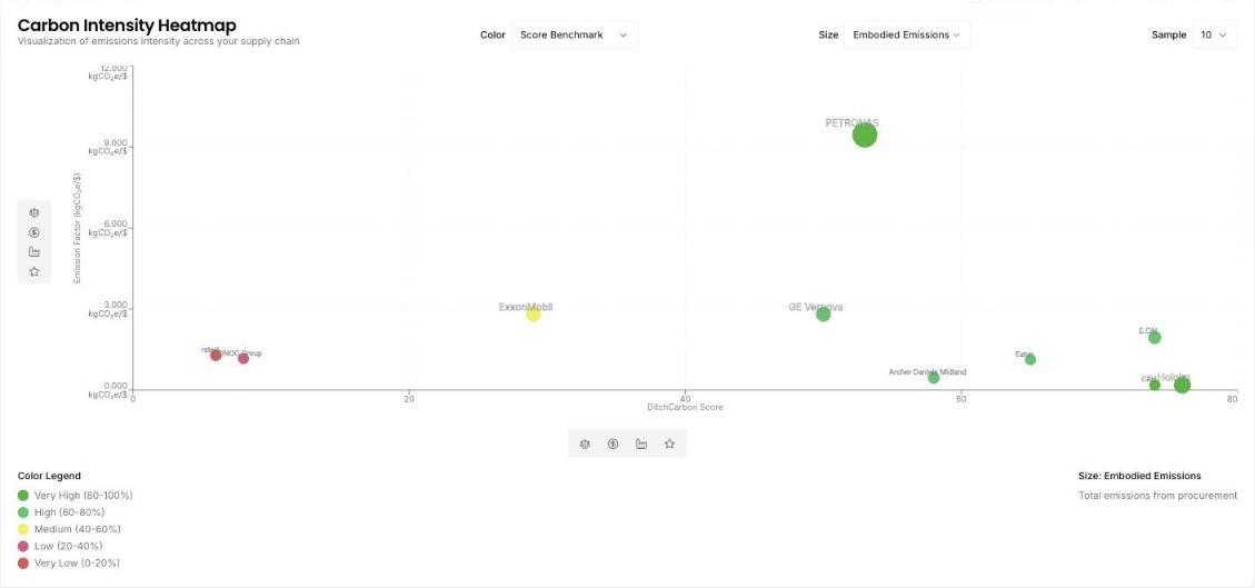
Carbon intensity heatmap
Which suppliers are carbon intensive and not yet acting on it?
The heatmap puts emission factor on one axis and the DitchCarbon score on the other. The top left is where the work is: high intensity, low score. Colour the bubbles by CDP disclosure, SBTi status or score benchmark, and size them by spend or embodied emissions, so the suppliers worth a conversation are the large bubbles in the wrong corner.
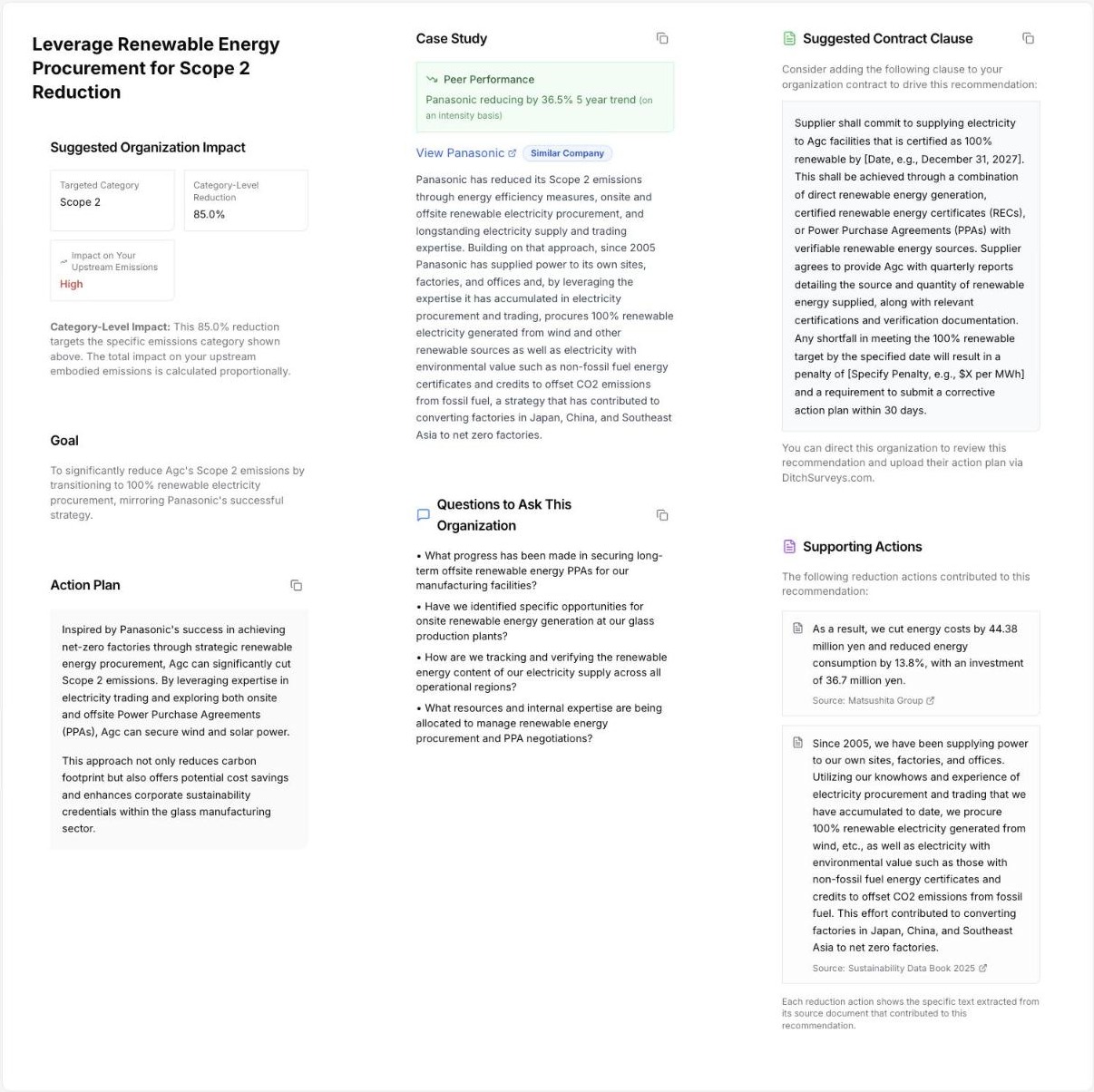
Supplier reduction plans
What do I actually say to a supplier about reducing its emissions?
Open the recommendation and the conversation is written. Each one carries a goal for that supplier and category, an action plan drawn from what a named peer did, four questions to ask, a suggested contract clause with a date and a shortfall remedy, and the peer's own reported actions behind it, each linked to its source document.
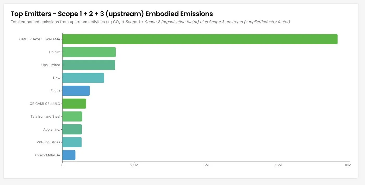
Top emitters
Which of my suppliers carry the most emissions?
The portfolio ordered by embodied emissions rather than by spend. A small invoice in a carbon-intensive sector outranks a large invoice in a light one, which is usually the opposite of what a procurement spend report shows, and it is the order that matters for reduction.
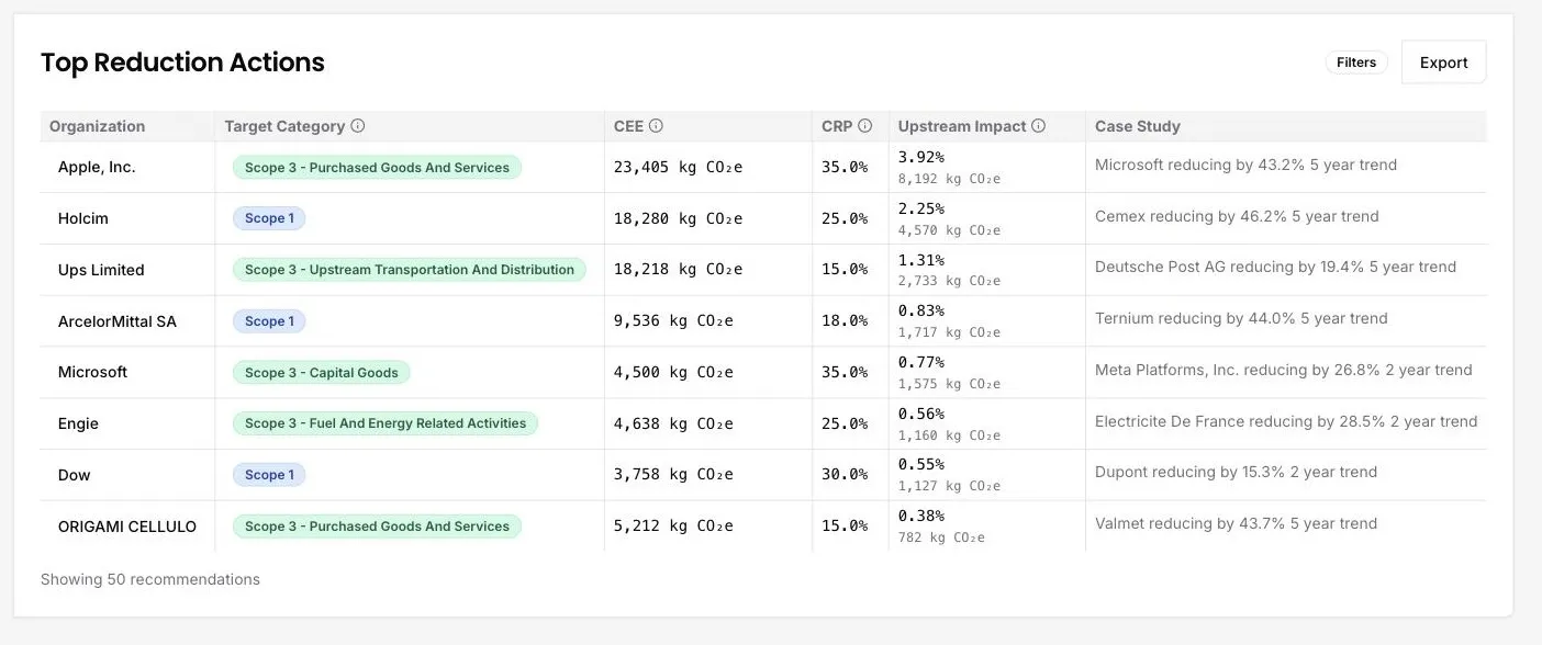
Ranked reduction recommendations
Which supplier conversation actually moves my footprint?
Every organisation and emissions category in the portfolio is ranked by the share of your total footprint that acting on it would move. Each line carries a realistic reduction percentage, the tonnes behind it, and a named peer already reducing at that rate, so the shortlist arrives with its own precedent.
See it on your own suppliers, portfolio or profile
Numbers you can defend within 2 weeks, or one profile that answers every buyer asking.