.svg)
Top emitters
DitchCarbon's top emitters view orders a portfolio by embodied emissions rather than spend, so the organisations carrying the footprint are visible regardless of invoice size.
The portfolio ordered by embodied emissions rather than by spend. A small invoice in a carbon-intensive sector outranks a large invoice in a light one, which is usually the opposite of what a procurement spend report shows, and it is the order that matters for reduction.
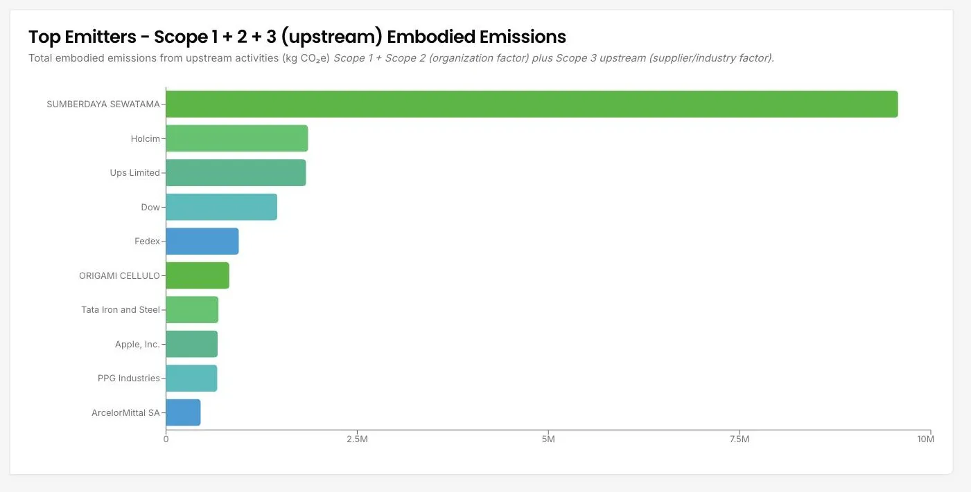
The scope selector gives six views: Scope 1, Scope 2, Scope 3 upstream, Scope 3 downstream, Scopes 1 and 2 plus Scope 3 upstream together (the default), and the full total. The default is the one that matches your Category 1 exposure: the organisation's own Scope 1 and 2 through its organisation factor, plus its upstream Scope 3 through the supplier or industry factor. A year filter sits alongside it.
Below the chart, the carbon intensity heatmap plots the same organisations by emission factor against DitchCarbon score, so the list of who carries the emissions becomes a view of who is doing something about them.
Common questions

See it on your own suppliers, portfolio or profile
Numbers you can defend within 2 weeks, or one profile that answers every buyer asking.