.svg)
Carbon intensity heatmap
DitchCarbon plots every organisation in a portfolio by emission factor against its DitchCarbon score, coloured by disclosure or SBTi status and sized by spend or embodied emissions, so high intensity, low maturity suppliers stand out.
The heatmap puts emission factor on one axis and the DitchCarbon score on the other. The top left is where the work is: high intensity, low score. Colour the bubbles by CDP disclosure, SBTi status or score benchmark, and size them by spend or embodied emissions, so the suppliers worth a conversation are the large bubbles in the wrong corner.
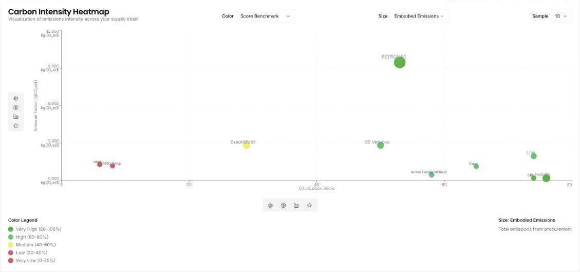
Top emitters tells you who carries the emissions. The heatmap adds the second question: are they doing anything about it. A supplier with a high emission factor and a high score is a leader in a hard sector, and the right ask is to learn from them. A supplier with a high factor and a low score has the emissions and none of the programme, and that is where engagement moves the number.
The colour options map to the evidence a procurement team actually asks for. Colour by SBTi near term target and the bubbles without one are the suppliers to ask for a commitment. Colour by CDP disclosure and the gaps show who has not yet reported at all. Long term target, net zero and the score benchmark band are the other options.
Size by embodied emissions to keep the conversation on the lines that matter to your total, or by spend to see where commercial weight sits. Emission factor and score are also available as sizes. The sample size and scope filters keep the chart readable on a portfolio of thousands.
Common questions

See it on your own suppliers, portfolio or profile
Numbers you can defend within 2 weeks, or one profile that answers every buyer asking.