.svg)
Monitor
How do I keep a Scope 3 baseline current without rebuilding it?
Monitoring reads from the same underlying data as the rest of the platform and updates as organisations publish. Every figure carries its source and change history, so the number you report in March and the number you report in September are the same number moved, rather than two separate exercises.
A Scope 3 baseline built once quietly stops describing the supply chain it came from. Organisations publish new figures, restate old ones and change methodology, and each of those movements lands somewhere in your number. Monitor exists so that movement is visible when it happens rather than discovered at audit time.
When a figure changes, the change arrives with its source and history attached, so the question in front of an auditor is never whether the number moved but why. That applies equally to the capabilities below with a page of their own and to the views that live only here.
Where are my supply chain emissions concentrated?
How do I track supplier progress against science-based targets?
How many of my suppliers actually report their emissions?
How do I compare carbon intensity against the industry?
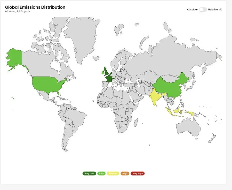
Global emissions distribution
Where are my supply chain emissions concentrated?
A world map shades each country by the emissions attributed to the organisations you buy from or invest in there. Switch between an absolute view and a relative one to separate the countries where you spend most from the countries where each unit of spend carries the most carbon.
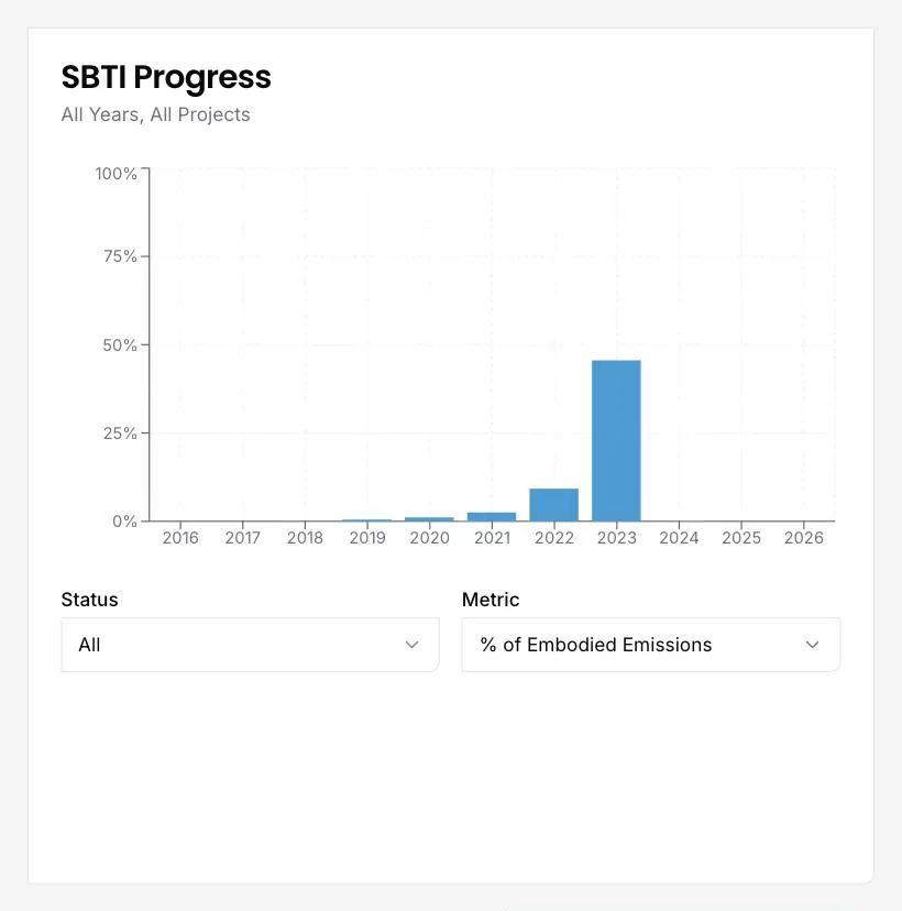
SBTi progress tracking
How do I track supplier progress against science-based targets?
The chart plots SBTi status across your portfolio year by year. Filter by status, from committed through near-term and long-term targets to net-zero, and choose whether to weight the result by share of embodied emissions, share of spend, or share of organisations.
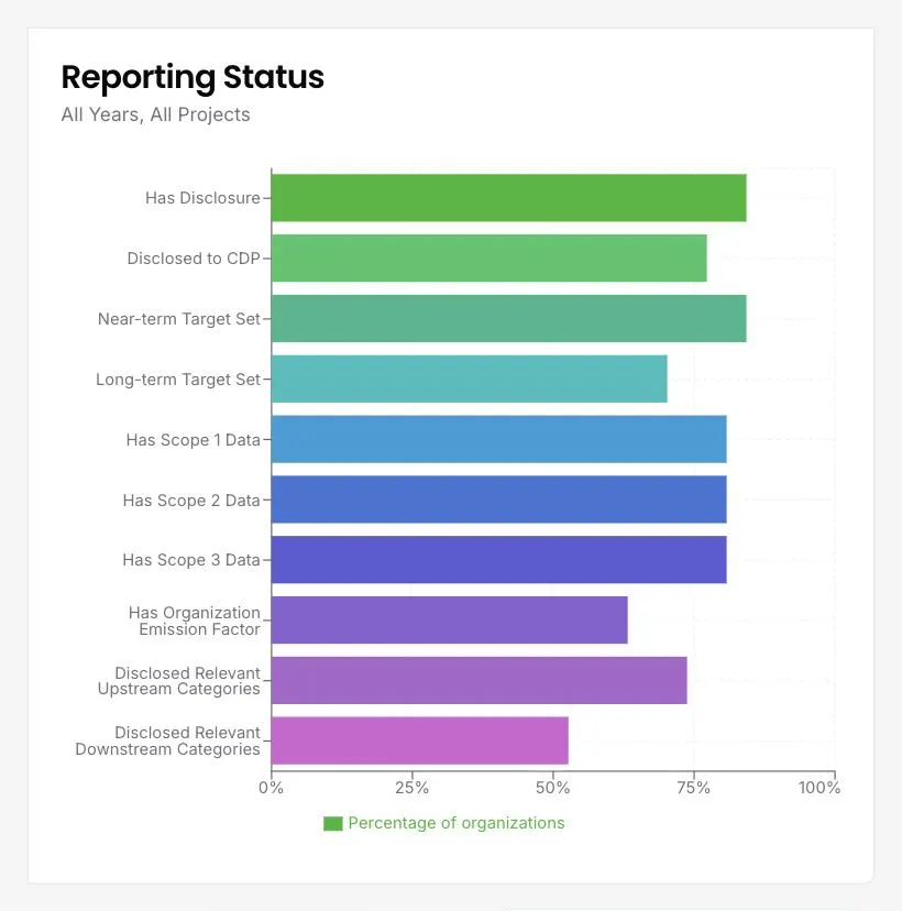
Disclosure coverage
How many of my suppliers actually report their emissions?
Ten measures across the whole portfolio, each as a percentage of organisations: whether they have a disclosure at all, whether they disclosed to CDP, whether near-term and long-term targets are set, whether Scope 1, 2 and 3 data exists, and whether relevant upstream and downstream categories are disclosed.
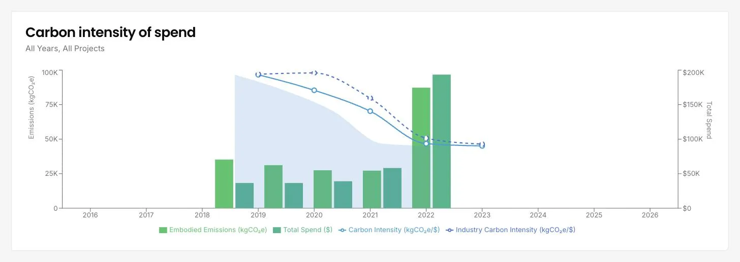
Carbon intensity of spend
How do I compare carbon intensity against the industry?
The chart plots your emissions and spend together with two intensity lines: your own carbon intensity, and the industry intensity for the same categories. Where your line sits below the industry line, the organisations you buy from are outperforming their sector. Where it sits above, the years and categories to look at first are visible.
See it on your own suppliers, portfolio or profile
Numbers you can defend within 2 weeks, or one profile that answers every buyer asking.