.svg)
Industry intensity and sector trend
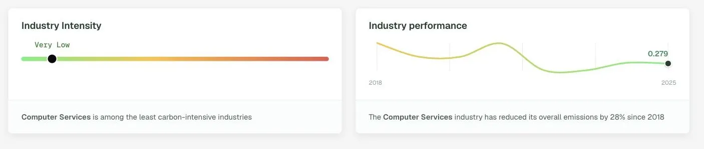
DitchCarbon places an organisation's industry on a carbon intensity band and shows how that industry's emissions have moved over time.
Is this a high carbon industry, and is it getting better?
Two readings side by side. The intensity band places the organisation's sector from very low to very high, and the trend line shows how that sector's emissions have moved since 2018. A low intensity sector moving the wrong way is a different conversation from a heavy sector improving fast.
Common questions
Why judge a supplier against its sector?
Is this supplier in a carbon intensive industry?
Available plans
Analyse
Status
Live
Last reviewed
September 17, 2026
See it on your own suppliers, portfolio or profile
Numbers you can defend within 2 weeks, or one profile that answers every buyer asking.


v260319.2
