.svg)
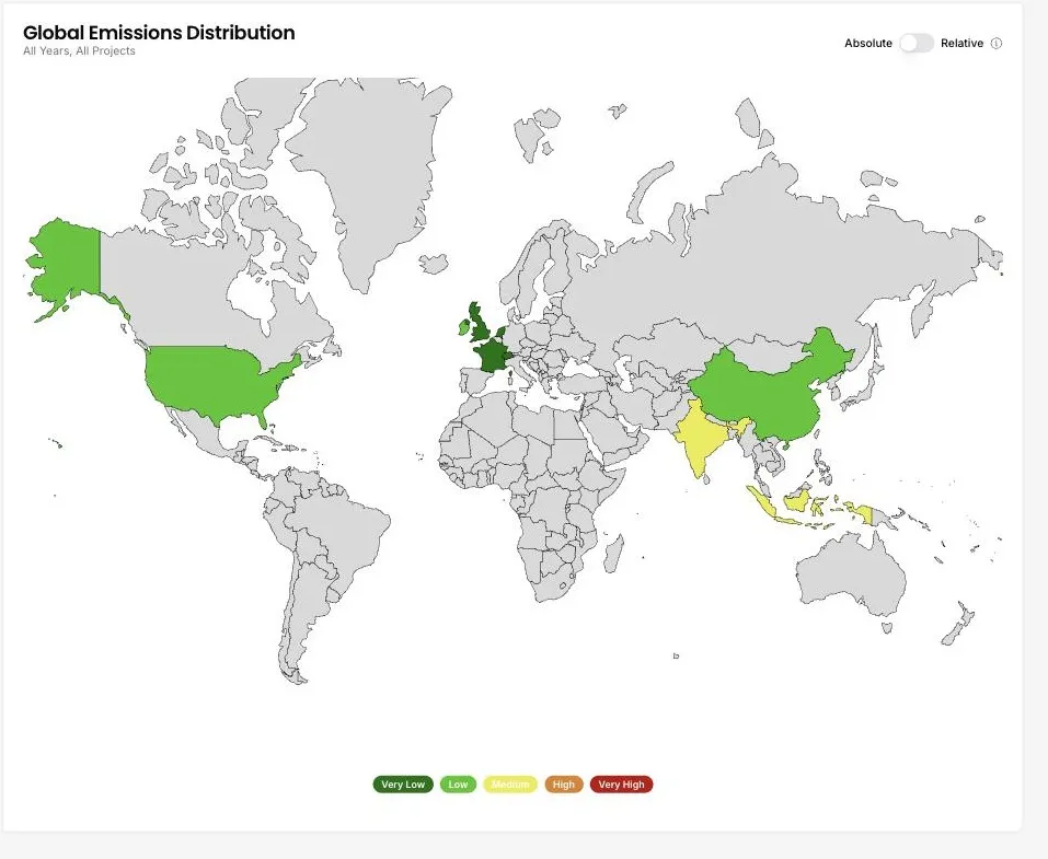
Global emissions distribution
DitchCarbon maps portfolio emissions by country, in absolute terms or relative to spend.
Where are my supply chain emissions concentrated?
A world map shades each country by the emissions attributed to the organisations you buy from or invest in there. Switch between an absolute view and a relative one to separate the countries where you spend most from the countries where each unit of spend carries the most carbon.
Common questions
What does the relative view show?
Where are my supply chain emissions concentrated?
Available plans
Collect + calculate
Analyse
Action
Status
Live
Last reviewed
September 17, 2026
See it on your own suppliers, portfolio or profile
Numbers you can defend within 2 weeks, or one profile that answers every buyer asking.


v260319.2
