.svg)
Emissions trajectory since 2011
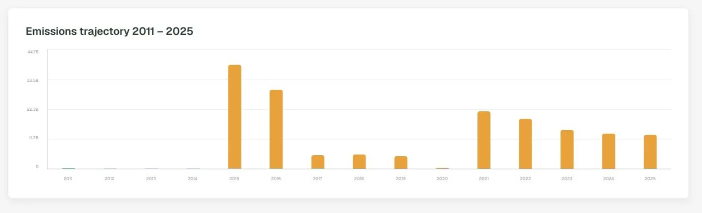
DitchCarbon charts an organisation's total reported emissions year by year from 2011, so a long-run direction of travel is visible at a glance.
Has this supplier's footprint gone up or down over time?
A fifteen year bar chart of total reported emissions, from 2011 to the current year. Gaps are shown as gaps rather than interpolated, so a missing year reads as an organisation that did not report rather than one that emitted nothing.
Common questions
How many years does it cover?
Can I see whether a supplier's emissions are falling?
Available plans
Collect + calculate
Analyse
Status
Live
Last reviewed
September 17, 2026
Related capabilities

See it on your own suppliers, portfolio or profile
Numbers you can defend within 2 weeks, or one profile that answers every buyer asking.


v260319.2
