.svg)
Emissions forecast to 2050
DitchCarbon projects an organisation's emissions to 2050 and plots the projection against the trajectory its own published targets require.
The chart runs actuals forward on a two year and a five year trend, then draws the trajectory the organisation's own target requires. The gap between trend and trajectory is the answer. Switch scope, absolute or intensity, and linear or logarithmic scale to read it different ways.
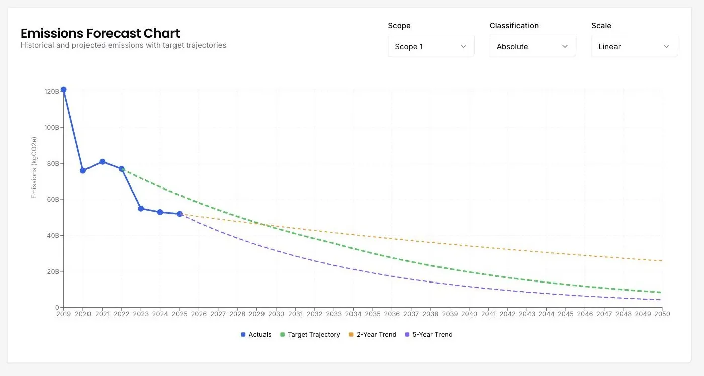
A target is a line an organisation has to reach. A trend is the line it is actually on. Drawing both from the same data turns a stated commitment into a measurable distance.
Two trend lengths are offered because they often disagree. A five year trend smooths out a single good year, while a two year trend catches a recent change of direction, and an organisation whose two year trend has turned upward is worth a conversation regardless of its five year record.
A logarithmic scale matters more than it sounds when a portfolio holds organisations three orders of magnitude apart in size. On a linear axis the small ones vanish.
Forecasting is projection rather than measurement, so the verification that covers the calculator does not extend to it. What is projected here is the organisation's own reported history carried forward.
Common questions

See it on your own suppliers, portfolio or profile
Numbers you can defend within 2 weeks, or one profile that answers every buyer asking.