
Supplier low-carbon electricity share against the local grid
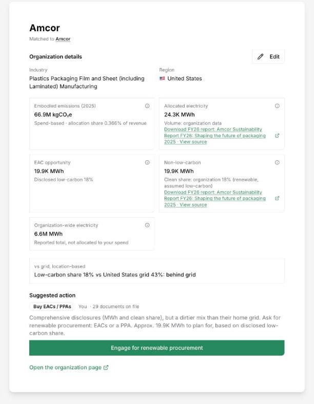
DitchCarbon compares each organisation's disclosed low-carbon electricity share with the low-carbon share of the grid in its region and marks it ahead of, at or behind that grid.
Each organisation's disclosed low-carbon electricity share is set against the low-carbon share of its regional grid. More than ten points above is marked ahead of grid, more than ten below is marked behind, and anything between is at grid. The comparison is location-based and appears on the Energy Map and on the organisation's profile.
A renewable percentage means little without the grid behind it. Sixty per cent low-carbon electricity is strong on a coal-heavy grid and ordinary on a hydro-heavy one, so a single threshold for every supplier rewards geography.
The grid comparison removes that. The Energy Map colours every country in five bands by its grid's low-carbon share, and each supplier row carries a marker for ahead, at or behind. The drawer gives it in one line: the organisation's share, the grid's share and the result.
Low-carbon here means renewable plus nuclear. Where an organisation discloses only a renewable share, that figure stands in and is flagged as assumed, so a supplier is never credited with more than it has published.
The marker also decides what happens next. A supplier ahead of its grid is a candidate to showcase, and one behind it with full disclosure is a candidate for renewable procurement. On the organisation's profile, the same grid line runs across the yearly electricity chart.
Common questions

Compare every supplier with its grid
Numbers you can defend within 2 weeks, or one profile that answers every buyer asking.


 Peer Insights
 by Scope 3 Peer Group
Ditch Carbon Ltd
167-169 Great Portland Street
London W1W 5PF
