.svg)
Supplier and portfolio table
DitchCarbon lists every organisation in a portfolio in one table, with its score, industry benchmark, region, spend, emissions, target status and disclosure status side by side.
One table, one row per organisation. Each row carries the DitchCarbon score, the industry benchmark for that score, region, total spend, embodied emissions, the emission factor method used, target status and whether the organisation disclosed to CDP. Sort on any column to put the organisations that matter at the top.
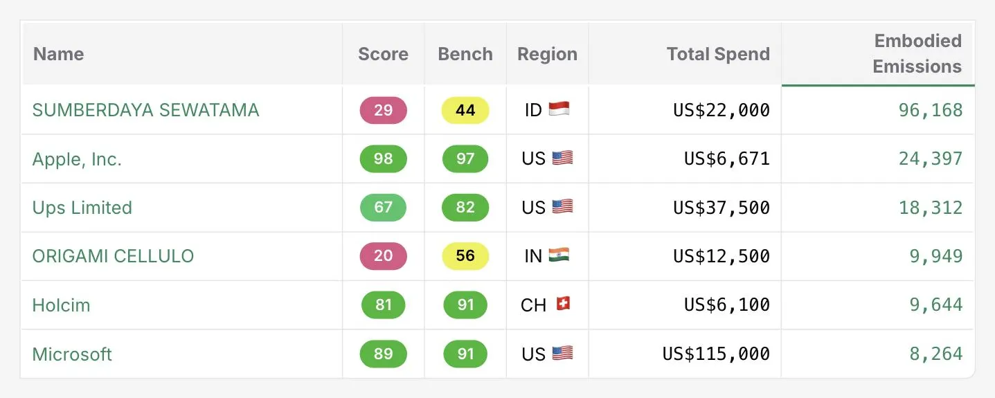
The columns are chosen so that a single row answers the question a category manager actually has: is this organisation large in my spend, high in emissions, ahead or behind its sector, and does it publish anything.
Sorting on embodied emissions puts the organisations carrying the footprint at the top, which is rarely the same order as spend. An organisation with modest spend and heavy emissions is the row worth opening first.
Every figure in the table carries its source and change history, so a number can be followed back to the document it came from rather than taken on trust.
Common questions

See it on your own suppliers, portfolio or profile
Numbers you can defend within 2 weeks, or one profile that answers every buyer asking.